Showing posts with label Brief 3: Alt Travel. Show all posts


Brief 3 : Finished Book
Finally after hours of work I have finished the book!


Brief 3 : Sample Page Layouts


I took on some of the advice in the last crit and made some of the images full bleed which I do think looks much better and the consistent layout style seems to work too.
Brief 3 : Beginnings of Book For Crit
This is as far as I have gotten on the book so far for the crit tomorrow:
Crit Feedback - 5.12.13
Today we had student led crits in small groups where we were allowed to present up to two briefs so I took in Sipi Coffee and Alt. Travel. The general consensus for both briefs was that they were going in the right direction and the main bits of feedback I received were little points to consider. I'll take each of these into account but I'm more or less set on what I'm doing for each brief now.
(feedback as recorded by Steph P.)
Crit feedback for Brief 4 : Sipi Coffee
- nice idea to have the brown bag for the coffee beans - very authentic
- consider promotional material - maybe this is needed?
- consider foil inside the packaging?
- good idea to expand the brief after Christmas
- maybe the brand would need to raise awareness before trying to sell anything?
Crit feedback for Brief 2 : Alt. Travel
- some images may work better full bleed
- colour could be reconsidered - may be inappropriate to location?
- have bigger pull quotes every now and again?
Brief 3 : Duotoning Images
After deciding on the colour scheme for the Ugandan book, I decided to duotone all of the images in the book with that colour.
These are some examples of photographs I have taken or that others in the group I went to Uganda with have taken, plus a few I found online being duotoned:
Kampala:

White water rafting on the Nile at Jinja:

Abseiling down a waterfall at Sipi:

Entrance to Ziwa Rhino Sanctuary:

Bwindi Impenetrable National Park:

Camping at Murchison River Lodge:

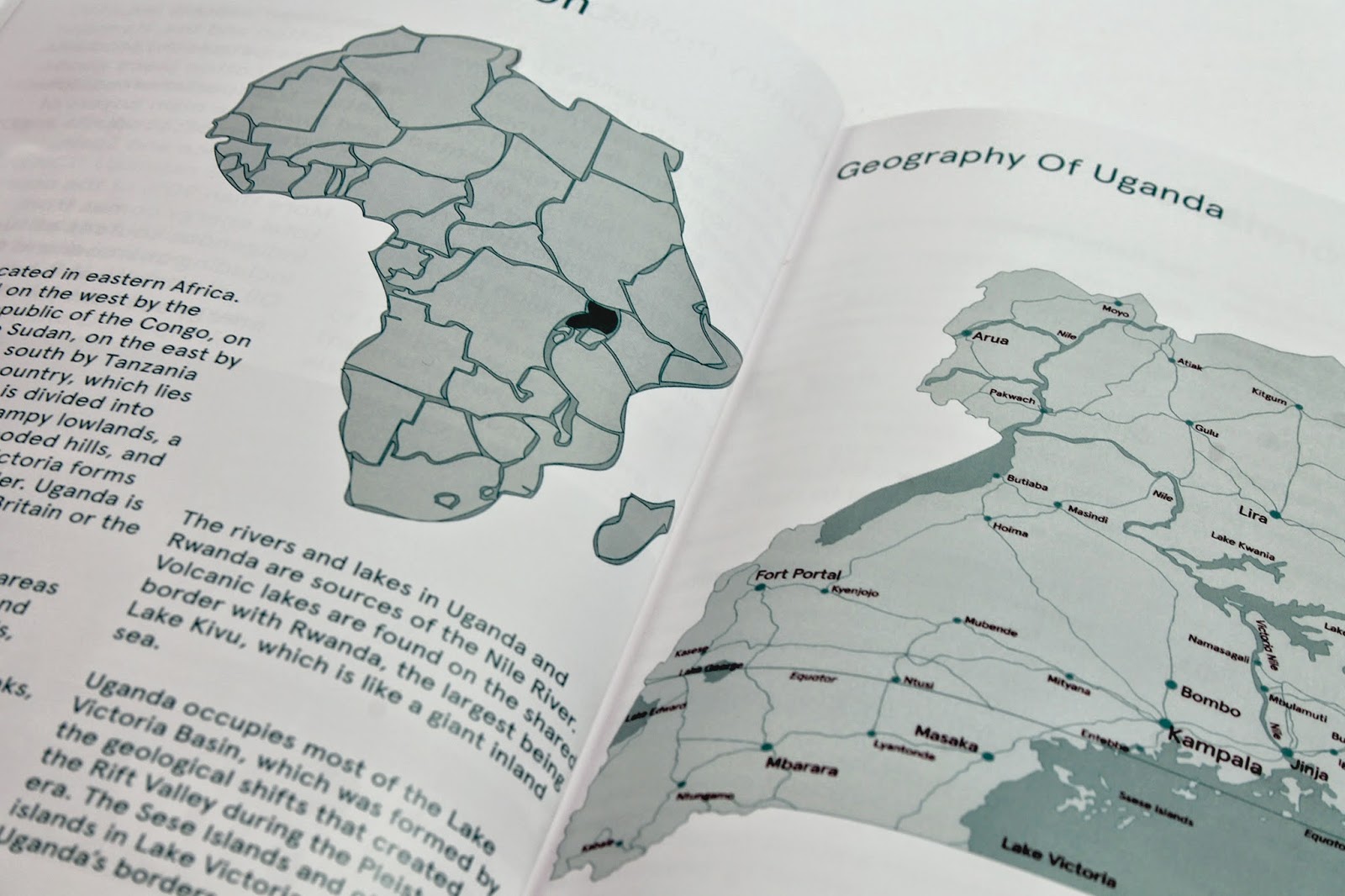
Brief 3 : Uganda Map

Ideally I'd want to have the map fold out quite big but as I want to have the book printed for me externally from college this would be quite difficult to achieve. I'll have to decide properly later on but I think it may just have to be as a double page spread within the book rather than a fold out.


Brief 3 : Colour Scheme Decisions

10% Magenta
60% Yellow
0% Black
Different ways of applying the colour to the logo:


Brief 3 : Initial Logo Ideas

Taking inspiration from different elements of the type experiments and mixing simple circles and rectangles together to produce a type based logo:


