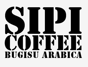
Some of the things I want to incorporate into the brand aesthetics are things which tie it as closely as possible to the area within which the coffee is produced.
This screen shot comes from the youtube video I posted earlier about fairtrade coffee production in Uganda and shows the style of printing the product name on the bags they sell the coffee in to the bigger name brands.
Playing around with some type ideas within this style as a first experimental idea:
After playing around with a few different typefaces and layouts, I've decided its much more important to actually create a brand identity that is unique, rather than simply focusing on the name and type/logo choices for now. I'm going to go back to looking at imagery specific to the area, such as the waterfalls and see how that can influence what I'm trying to convey with the brand. I want the coffee brand to have more of a personality to it than simply a range of packaging as I haven't yet decided whether or not to continue this brief on into branding a coffee shop that would be an extension of the brand.


